In custom silicone product development, “the color looks different from the picture” is one of the most frequent customer complaints. In everyday industry situations, rework caused by color mismatch can exceed 20%, directly increasing communication costs and lead times and even damaging customer trust in appearance consistency. This content is compiled from YueHouDZ’s practical experience in silicone customization and production, for reference.
1. Why “Copying the Color from a Photo” Keeps Failing
Many customers specify colors using smartphone photos or screenshots, but the result often doesn’t match expectations. This is not simply a “mixing skill” issue—it comes from the special behavior of silicone materials combined with the “deception” of images.
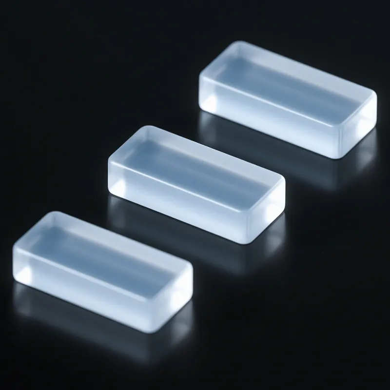
Silicone color matching is like a precision experiment: a 0.5% difference in masterbatch ratio, a 10°C change in curing temperature, or switching the base material from transparent to milky white can all cause the color to shift.
For example, a customer’s “light pink” photo may be taken under warm lighting, and the actual matched color can become about 30% more vivid than expected. Also, adding the same blue masterbatch into a white silicone base versus a black silicone base will produce different tones—often about one visible shade level apart.
More importantly, image display depends on the device’s color gamut (phone screens, monitors). The same picture can look more red or more blue on different devices. Relying on photos alone cannot establish a unified color perception between supplier and customer.
2. Say Goodbye to “Photo Colors”: What Is the Professional Way to Specify Color?
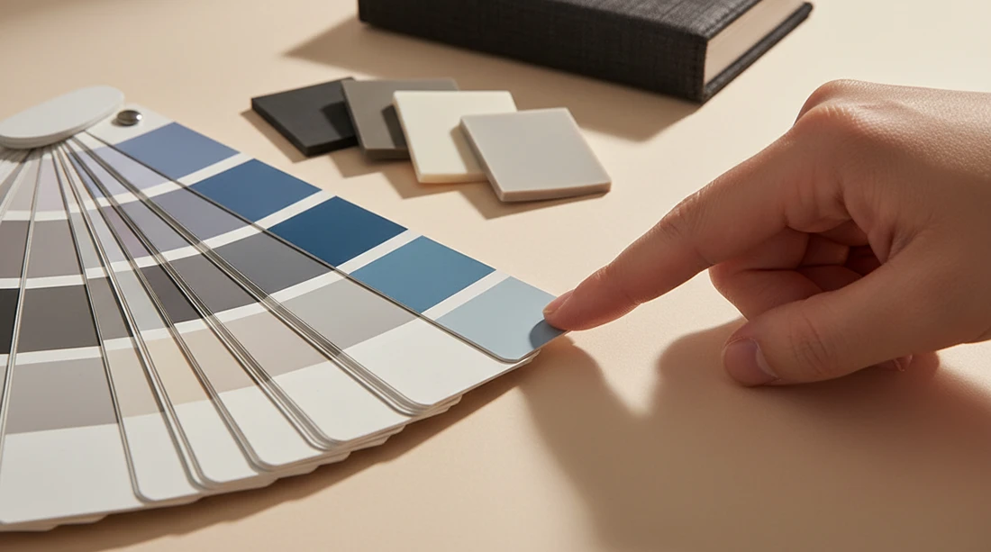
The core solution is to replace “photo descriptions” with a standardized language. The best choice is an internationally recognized Pantone color code.
Pantone provides a tangible physical color standard. Choose the type based on product characteristics:
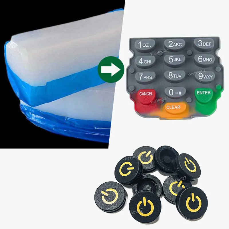
- If the silicone product is a solid, opaque material (such as buttons, gaskets, seals), prioritize Pantone C/U (commonly used for coatings/inks and other solid-color applications).
- If the surface has a matte or textile-like feel (such as silicone watch straps), you can reference Pantone TCX (textile system).
One customer customized silicone wristbands and initially provided a “hazy blue” photo. After three rounds of adjustment, they were still not satisfied. Once they switched to Pantone 16-4120 TCX, the first sample was approved, saving roughly two weeks of back-and-forth communication.
In addition, the inherent characteristics of silicone must be communicated in advance: transparent silicone tends to make colors look lighter, and a frosted/matte surface often makes the color appear “one level darker.” These details should be considered when specifying color to build a solid foundation for accurate matching.
3. How to Control Color Difference to a “Barely Noticeable” Level
After the color standard is clearly defined, high-precision color-matching technology becomes the “final safeguard.”
The industry commonly uses ΔE as a standard metric for color difference (an international indicator for measuring color deviation). A smaller value means a smaller difference. When ΔE ≤ 1.0, under the standard light source D65 (simulating midday daylight), the human eye typically cannot perceive the color difference.
To achieve this level of accuracy, a spectrophotometer is used to measure the target color’s Lab values (the “coordinate parameters” of color). Then a computer color-matching system calculates the masterbatch ratio, and production experience is used to fine-tune curing parameters.
For example, dark-colored silicone may require extending the curing time by about 5 minutes to stabilize masterbatch fixation. Light colors often require controlling the curing temperature to 160°C ± 2°C to prevent pigment discoloration from excessive heat. Only through this workflow—quantitative analysis + experience-based calibration—can silicone products reach an outcome where “the difference is not visible to the naked eye.”
Conclusion
To solve silicone color mismatch at the root, follow these three steps:
- Stop relying on “photo-based color.” Use Pantone color codes (C/U or TCX, selected by material/surface characteristics) to unify the color standard.
- Account for silicone characteristics in advance, including base transparency and surface texture, and how they affect color appearance.
- Use professional deviation control: with a spectrophotometer and computer color-matching, keep ΔE ≤ 1.0 (typically within the human eye’s unnoticeable range).
By doing these three things well, you can effectively avoid the “we gave a picture but can’t get the same color” dilemma and achieve more stable, repeatable color reproduction for custom silicone products.